We Measure Harm, We Mean Benefit
Medicine knows how to tell you to stop. It can only do it where somebody already agreed what better would look like — which covers a great deal of medicine, almost none of health, and none of the noise you actually live in.
Part 1 counted 74,719 codes for what is wrong with you and no agreed metric for whether you are healthy. This is what that asymmetry does downstream. A weight-loss drug carries a stopping rule written by the FDA; the supplement sold for the same purpose carries nothing, and nothing in the apparatus would ever produce one. The machinery for saying stop is real, it works, and it reaches almost nobody — which is why the honest move is rarely to stop, and almost always to switch.
The short version. Every claim here links to the source the full essay cites — a summary that strips its provenance is doing the thing this piece argues against.
Part 1 counted 74,719 codes for what is wrong with you and no agreed metric for whether you are healthy. Follow that downstream.
- The machinery exists. Contrave’s label tells the prescriber to discontinue if the patient has not lost 5% of body weight by week 12. Treat-to-target sets a number and a review date. The ATS time-limited trial agrees in advance what improvement and deterioration will look like.
- And it has a hard boundary. Every one needs a validated surrogate sitting on the causal path of a diagnosed condition. The FDA lists 200+ surrogate endpoints accepted as a basis for approval; its Biomarker Qualification Program has qualified single digits since it began. The stock is large and fixed. The pipeline is closed.
- Surveillance has the same shape. Sentinel watches ~138.7M people and VigiBase holds 40M+ reports from 160+ countries — for any product, in anyone. Benefit surveillance exists but must be built one named condition at a time. Harm is general; benefit is enumerated.
- Regulation inverts the burden, and the noise is the consequence. For a new prescription drug the maker proves benefit first. For a supplement, nobody proves benefit and the FDA must prove harm afterwards. There were 4,000 supplement products when that rule passed in 1994; the FDA now estimates more than 100,000. When evidence is not required, what is left to compete on is brand.
- Evaluation grades the wrong object, and grades it badly. A review of 445 LLM benchmarks found 16% used statistical tests, 53% argued their measure measures the thing, and 48% of the definitions given are contested. Even the serious efforts grade the machine’s output. None grades whether a person decided better.
- And the reader has to exist. In our own data, 17 of 20 carbohydrate foods are misread against expert consensus, and 70% are misread in both directions at once (the per-food readout). Read against the noise, that is not ignorance. It is the correct response to an environment built to be uninformative.
Who this leaves out. Anyone below the diagnostic threshold, taking something that never sat on an approval pathway, chasing something no biomarker was ever qualified for. For them nothing can say stop, so the default is that you continue.
What is worth building — and it is not new. Roger Neighbour asked the whole question in 1987: “If I’m right, what do I expect to happen? How will I know if I am wrong?” British GPs have been taught it ever since, and it gets written down 3% of the time. The gap is not the concept. It is that nobody made it an object a person can carry.
And the verb is wrong. Stop needs proof the thing failed, which needs the surrogate nobody has. Switch needs only that your attention is finite. So the usable skill is triage: if an effect is big enough to feel — sleep, alcohol, a stimulant — run a real trial on yourself, one change, time-boxed, with the observation written down first. If it is not, no amount of attention will resolve it, and the honest move is to pick on evidence quality and go spend the attention somewhere it can register.
The question that sorts the serious from the rest: what would your product have to observe to tell someone to switch away from it?
There is a weight-loss drug whose label tells the prescriber when to give up on it.
Contrave. Section 2.1: evaluate response after twelve weeks at the maintenance dose, and “if a patient has not lost at least 5% of baseline body weight, discontinue CONTRAVE, as it is unlikely that the patient will achieve and sustain clinically meaningful weight loss with continued treatment.”
Read that twice, because it is doing something rare. It names a number, a date and a consequence, and it fixes all three before anybody starts. It is a falsification condition for a treatment decision, written by the regulator, sitting in the package insert.
Now put berberine next to it — a supplement marketed for two years as “nature’s Ozempic.” Same goal. Frequently the same person, in the same month, choosing between the two. There is no such sentence anywhere on it, and more to the point, nothing in the apparatus would ever produce one.
Part 1 counted 74,719 codes in ICD-10-CM for what is wrong with you against no agreed metric for whether you are healthy, and called that the health gap. This essay follows it downstream, to the moment somebody has to decide whether to keep doing the thing they started.
I spent this month mapping the organizations between published evidence and somebody acting on it, looking for who says stop. What I found was not an absence. It was a boundary.
What it takes to say stop
Medicine says stop all the time. Rheumatoid arthritis has a validated disease activity score, so treat-to-target sets a target, a review interval and an escalation rule, and it is the international standard of care. Oncology has RECIST, so progressive disease is defined in advance and the same criteria that started a treatment can end it. Critical care has the time-limited trial — a formal consensus definition with sixteen essential elements, including measurable markers of improvement, measurable markers of deterioration, and a reassessment date, all agreed with the family before the therapy begins.
And Contrave’s label is a stopping rule for an ordinary outpatient prescription, put there by the FDA.
So the machinery exists — mature, codified, and in places mandatory. Any version of this argument that begins nobody has thought about when to stop is wrong, and a reader who works in rheumatology or intensive care would put it down at that sentence.
The boundary
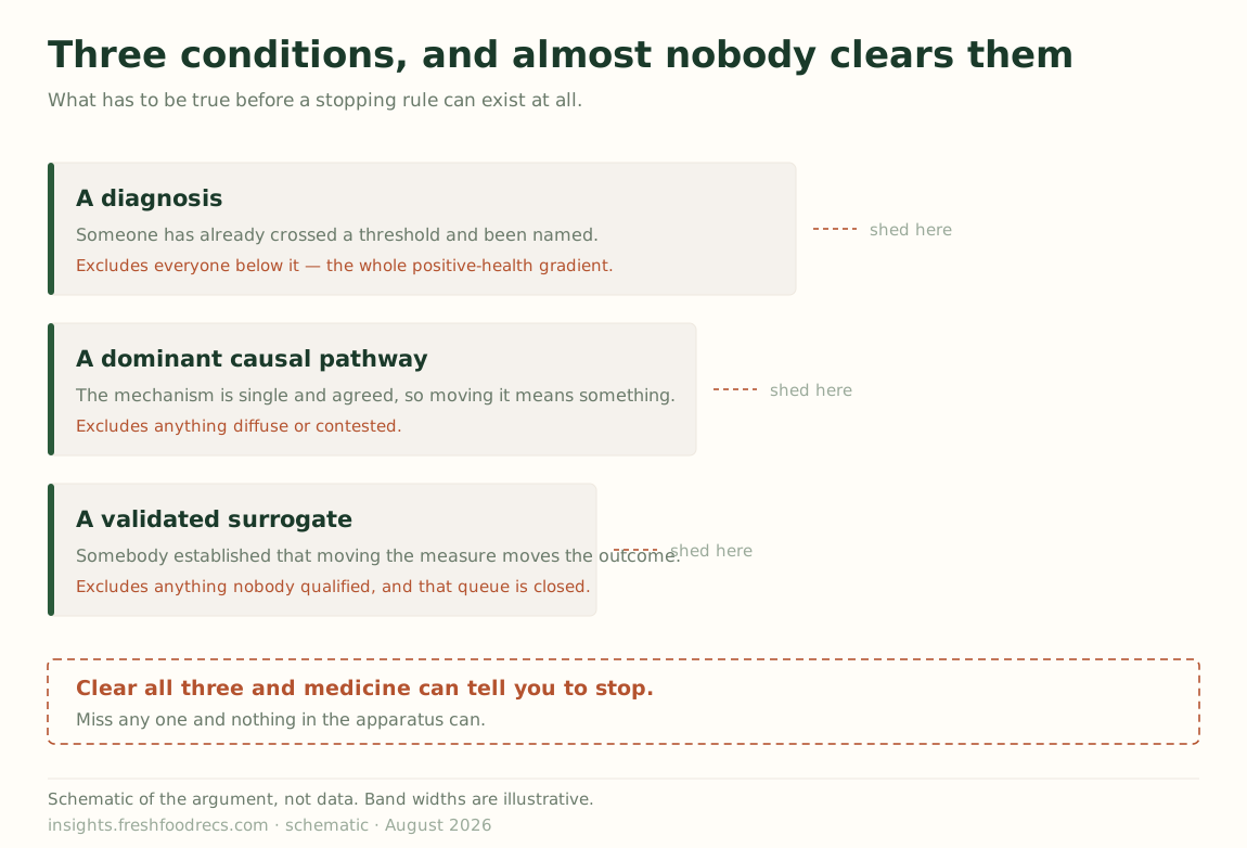
Each of those examples required the same thing: a validated surrogate sitting on the causal path of a diagnosed condition. A disease activity score. A tumour measurement. A body-weight percentage that predicts sustained loss.
That requirement is doing enormous work. It needs a diagnosis, which rules out everyone below the threshold. It needs a causal path, which rules out anything whose mechanism is diffuse or contested. And it needs somebody to have already validated the measure — to have established that moving it moves the outcome anyone actually cares about.
That last condition is the binding one, and the arithmetic there is stark. The FDA publishes a table of surrogate endpoints it has accepted as the basis of approval; it runs to more than two hundred entries. Its Biomarker Qualification Program — the formal route by which a genuinely new measure becomes generally usable — has qualified single digits since it began.1
The stock of ways to measure benefit is large and essentially fixed. The pipeline for adding to it is, for practical purposes, closed.
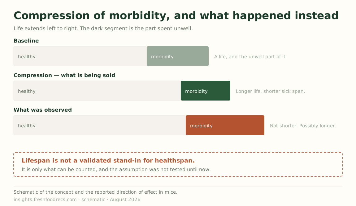
Watch a new one try. Compression of morbidity — the idea that a good intervention should not just extend life but shorten the sick part at the end of it — is about as close as anyone has come to naming a positive-pole outcome you could actually measure, and it is the endpoint the entire longevity field is implicitly selling.
Thapa et al. went looking for it in the cleanest possible setting: life-extending dietary interventions in mice, with survival and vitality tracked to the end. The interventions extended life. They did not compress morbidity — and the models suggested a possible expansion of it, worst under chronic caloric restriction.2
Be precise about what that is, because it is subtler than a surrogate going wrong. Lifespan is not a validated surrogate for healthspan. Nobody qualified it as one, and there is no qualified surrogate for healthspan at all — that is the whole problem. Lifespan is simply the thing that can be counted, so it is what gets counted, and the field reports lifespan while talking about healthspan on the unexamined assumption that the two travel together.
Thapa et al. tested the assumption. In mice, it did not hold — and anyone reading the lifespan number alone would have been confident they were winning.
The same paper then says the quiet part: the field needs to “standardize the nomenclature” and “establish a ‘default’” analysis, because there are several incompatible ways to compute compression of morbidity and no agreement on which one counts. That is Part 1’s condition failing in real time — explicit operationalization; imperfect is fine, vague is not. An endpoint with several definitions and no default is not yet a measure. It is a word.
So the ability to say stop is close to coextensive with having a validated surrogate, and validated surrogates cluster tightly around diagnosed conditions with a dominant pathway. That covers a great deal of medicine. It covers almost none of health.
The person this essay is about falls outside all three conditions at once. Below the diagnostic threshold. Taking something that never sat on an approval pathway. Pursuing something — more energy, better sleep, aging well — for which no biomarker was ever qualified and, at the current rate, never will be. For them the question is this working? has no instrument behind it. Not because the instrument broke, but because nobody built one for that question.
The same shape, one layer up
That boundary is not confined to the clinic. Look at the surveillance layer.
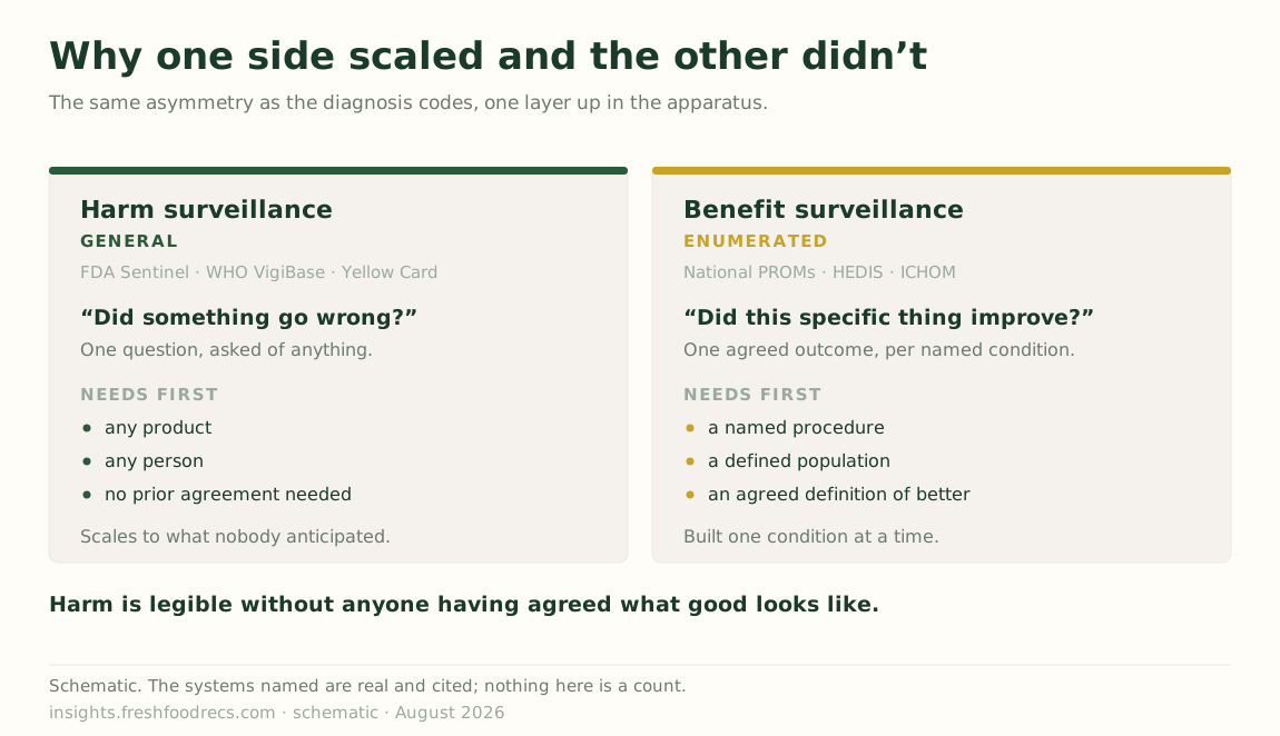
The FDA’s Sentinel network has roughly 138.7 million members currently accruing data. The World Health Organization’s VigiBase holds over 40 million individual case safety reports from more than 160 countries. Uppsala Monitoring Centre, which runs it, has run algorithmic signal detection in production since 2014 — not as a demonstration, as plumbing — because signal detection turned out to be a well-posed problem with labels, volume and a cost function.
Benefit surveillance is not absent, and it would be easy to write as though it were.3 England’s National PROMs Programme collects before-and-after patient-reported outcomes on NHS-funded joint replacement at national scale, linked to the National Joint Registry. HEDIS reports benefit measures across US managed care. ICHOM publishes standard outcome sets by condition.
But look at what each one needed before it could start. A named procedure or a named condition. A defined population already inside the system. An agreed outcome for that specific thing — which is to say the same validated surrogate, arrived at the same slow way.
Sentinel needs none of that. It watches any product, in anyone, and asks a question — did something go wrong? — that can be posed without knowing in advance what you were hoping for. Harm is legible without a prior agreement about what good looks like; benefit is not. Harm surveillance is general; benefit surveillance is enumerated — and the enumeration has to be done by someone who already agreed what better means, which is exactly what Part 1 said we have no general answer to.
The burden of proof inverts
The surveillance asymmetry is not an accident of what was easy to build. It is written into the law, and the clearest statement of it comes from the National Institutes of Health.
“Unlike drug products, there are no provisions in the law for FDA to approve dietary supplements for safety or effectiveness before they reach the consumer. Once a dietary supplement is marketed, FDA has to prove that the product is not safe in order to restrict its use or remove it from the market.”4
For a new prescription drug, the manufacturer must demonstrate benefit before anyone can sell it. For a supplement, nobody demonstrates benefit at all, and the regulator must demonstrate harm afterwards. On one side of the line somebody has to prove the positive pole. On the other, the only question anyone is ever obliged to answer is whether it hurt you.
For the products people take on their own initiative, in the categories where “should I still be doing this?” is the live question, there was never a benefit claim on record to revise against. You cannot detect that something stopped working if nothing ever established that it worked.
Newer categories sit in stranger territory still — compounded peptides and research chemicals move through channels where neither the drug bar nor the supplement framework applies cleanly. I am not going to characterise that regulatory position precisely, because I have not verified it to the standard this essay demands of everyone else. But the direction is not in doubt: the further a product sits from the drug approval pathway, the less anyone ever had to show it does anything.
And none of this reaches the person deciding. Someone choosing between a prescription, a supplement and a peptide is choosing between three completely different evidence regimes, and nothing in the purchase tells them which one they are in.
What the inversion actually produces
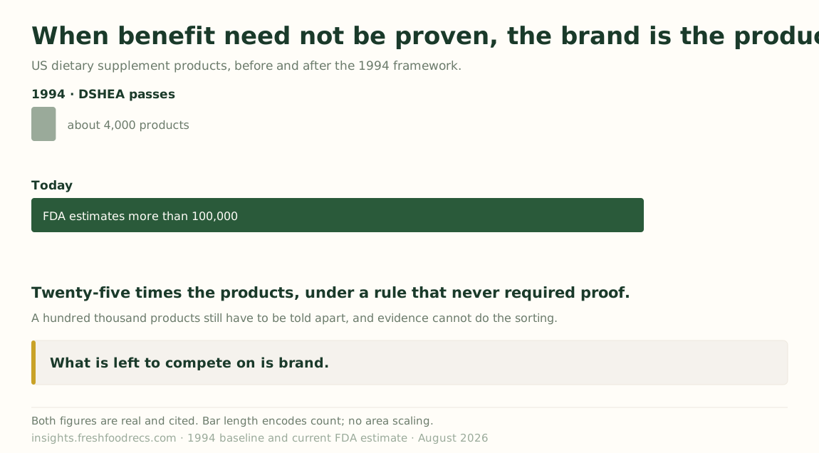
When DSHEA passed in 1994 there were about 4,000 dietary supplement products on the US market. The FDA now estimates more than 100,000; the NIH’s label database catalogues over 125,000.5 That is roughly twenty-five-fold growth in a category where no one, at any point, has to demonstrate that anything works.
Now ask the obvious commercial question. A hundred thousand products have to be differentiated from one another somehow, and most of them are the same handful of compounds. Evidence is not required and mostly does not exist, so it cannot do the sorting. What is left is brand and claim — and for supplements it is mostly brand. The molecule is a commodity; the packaging, the founder, the aesthetic and the person telling you it changed their life are the product.
So the influencers are not a corruption of the system. They are the system working exactly as designed. You do not need bad actors to get here. You need only a rule that makes evidence optional and a market large enough to fill the space.
And notice where that leaves the person. Our own map of who is building at each step of a consumer health decision has its thinnest coverage at exactly the point where the claim arrives — the unbidden encounter, the feed, the shelf, the recommendation nobody asked for. Nearly everyone is building for the person who already has a question and is already looking. The moment the belief is actually formed is owned by parties with no obligation to be right.6
Which is why I have stopped describing this as a public understanding problem. If the only signal reaching you is a claim, and no claim ever had to be earned, then being confused is not a failure of literacy. I would be confused too.
And again in the newest infrastructure
The same boundary turns up once more in the place I least expected.
AI for science is trying to build serious evaluation, which is not the same as having it. The state of the field is worse than the outside impression. A team of 42 researchers with 29 expert reviewers systematically reviewed 445 language-model benchmarks from the leading machine-learning and NLP conferences. Sixteen percent used uncertainty estimates or statistical tests to compare results. Fifty-three percent offered any evidence that their benchmark measures the thing it claims to measure. Of the benchmarks that bothered to define their target phenomenon at all, nearly half define something contested — a concept with many possible definitions, or no clear one.7 A separate assessment of two dozen widely used benchmarks found large quality differences, poor reproducibility, and most reporting no statistical significance at all.
Sit with the 48% for a moment, because it is this essay’s own disease. A benchmark measuring a contested phenomenon is a stage tag that excludes nothing. It is compression of morbidity with three incompatible definitions and no default. It is “health” with 74,719 codes for its opposite. The measurement layer for AI acquired the defect independently.
Against that background, AstaBench is a genuinely serious response. The Allen Institute for AI put 57 agents across 22 agent classes against more than 2,400 problems, with standardised tooling and frozen prices so nobody buys their way up the table.8 But read why they say they built it: existing benchmarks “lack reproducible agent tools,” “do not account for confounding variables such as model cost and tool access,” and “lack comprehensive baseline agents necessary to identify true advances.” And its own conclusion is that AI “remains far from solving the challenge of science research assistance.” In the paper the best agent scores 53.0 overall and nothing beats 33.7 on data analysis; the live leaderboard has since moved past both, which is the point of having one.
So the field needs more of this, not less — better benchmarks, held to the standard those 445 mostly missed. But more of it will not close the gap this essay is about.
Every one of them — the rigorous and the sloppy alike — scores an artifact the machine produced. Whether the agent found the right papers. Whether the code ran. Whether the reproduction matched. Whether the summary was faithful. I checked rather than assumed: across eighty-eight pages, scoring partitions cleanly into an LLM judging output against a rubric, or a program checking output against a reference. The words downstream, user study and decision quality never appear.
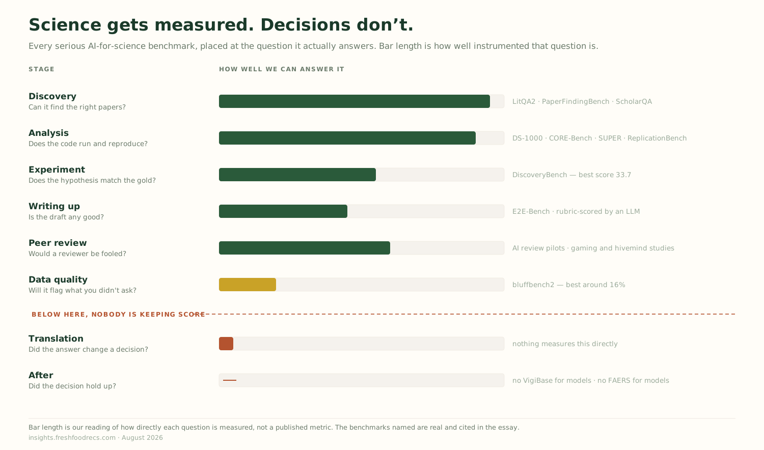
One team has got closest. Posit’s bluffbench2 does not ask whether an agent can make a chart; it asks whether the agent will tell you something is wrong with your data when you did not ask.9 Across 26 scenarios — a stuck sensor, a bad join, swapped columns, imputed values sitting neatly on a fitted line — the best models manage around 16%.
The finding underneath is more interesting than the number. Models sometimes added a fitted line without being asked, which is reasonable and idiomatic. Posit’s own writeup, from reading the logs rather than running a controlled comparison, says doing so “seems to substantially lower the chances that the model will notice the plotted artifact.” Their hedge, and it should be mine.10
If it holds, the smoother did what smoothers do: it made the picture look like a relationship, and the model believed its own chart. Not a capability failure and not deception — a plausible default that quietly hid the thing which would have invalidated the result, in a system with no way to notice it had been hidden.
What this costs the person
Three layers, one shape: sickness instrumented in general and health not at all; harm in general and benefit only where somebody enumerated it; the machine’s output and not the decision. Follow all three downstream to a person and the last step is the one that breaks. Somebody has to find out the thing is not working, and stop.
Surveying the organizations between evidence and action, almost nothing is built for that. Be careful about where that comes from: the stage definitions behind any count of mine only got written inclusion tests after the current release shipped, and the map is still behind them.11 So take the smaller, checkable version:
Of the organizations sitting between evidence and action, one produces a decision artifact you could re-read a year later.
That one is MDCalc, and it shows the standard is reachable. Its calculators ship with the derivation study, the validation lineage, and commentary from the person who built the score. It hosts the PREVENT equations — the American Heart Association’s cardiovascular risk model, which replaced the Pooled Cohort Equations that had governed statin decisions for a decade. And the first line of its Pearls and Pitfalls says the tool “updates and replaces the AHA/ACC Pooled Cohort Equations published in 2014,” with references to head-to-head comparisons.12 So the artifact carries its derivation and its revision history.
What it does not carry — what nothing carries — is the consequence. That is Part 3: when one equation replaces another, it moves who gets treated.
Notice, too, the shape of what surrounds the decision. Primary care practices, supplement brands, wearable companies, subscription apps. Every one is built to start you on something and to sustain you on it. None is built to stop you — which is unsurprising, since stopping needs a measure most of them do not have, and a subscription that ends is a subscription that ends.
I should be straight about my own position. FRESH scores foods. It can say a great deal about what is in something and how the evidence stacks up. It cannot currently tell you to stop doing what it told you six months ago, because that needs the same missing measure. Naming a gap you are standing in is uncomfortable and it is the only honest place to write from.
And the reader has to exist
There is a third prerequisite, and it is the one I am least comfortable with, because our own data speaks to it directly. A decision artifact carrying options, effect sizes and a stopping rule presupposes somebody who can read one.
We asked consumers to rate twenty carbohydrate foods for healthfulness and compared their beliefs against a pooled expert consensus.13 Seventeen of the twenty land at Alignment Grade C or D — far from where the experts sit. Only two, an apple and a soda, actually line up.
But the interesting part is not the size of the gap. It is the structure.
The misses are not random and they are not uniform ignorance. The public is consistently harder on carbohydrate foods than the people who study them — every potato food, including a plain baked potato, is read as less healthy than experts rate it. Honey runs the other way, read as far healthier. The two juices invert: a sugary “vitamin C” drink earns a health halo while genuine 100% juice gets marked down. And seventy percent of the foods carry misperception in both directions at once — white rice splits almost evenly.
That last number changes what education means here, and it is the fingerprint of the noise rather than of ignorance. Ignorance points one way: people would be uniformly too generous or uniformly too harsh. Beliefs that split in both directions on the same food are what a contested claim environment produces — which is exactly what a hundred thousand products competing on narrative would predict.
“Raise health literacy” is the wrong instrument, in the same way “raise awareness” is the wrong instrument for a measurement problem: the reader is responding correctly to what reached them.
And notice the asymmetry has an educational twin. We teach people to recognise when something is wrong — symptoms, warning signs, the list of things that mean call a doctor. We teach almost nothing about how to tell whether something is working. Ask most people what would make them stop a supplement and the honest answer is if it gave me side effects — which is, once again, the harm pole. There is no widely taught vocabulary for benefit, no everyday sense of what a small effect looks like, no intuition for the difference between a relative and an absolute risk.
So we have three missing prerequisites, not one:
- A benefit measure to put in the artifact — Part 1’s gap.
- An obligation on anybody to produce one — the inverted burden of proof.
- A reader who can interpret it — the numeracy gap, which our own data suggests is structured rather than general.
Any one of those alone would be a hard problem. Together they explain why the last stage is empty better than any market story does.
What is worth building
There are two decision surfaces and they do not connect.
The professional one exists and is thin but real: MDCalc, GRADE, guideline tooling, the calculators clinicians actually open mid-visit. It is evidence-linked, it has standards, and it has an installed base.
The consumer one barely exists. People make more health decisions outside a clinic than inside one — what to eat, what to take, what to stop, what a wearable reading means — and the tools they reach for are optimised for engagement rather than for deciding. Almost nothing tells them what would count as this-is-not-working.
The valuable thing is not a better consumer app. It is a decision artifact that travels between the two — built for a person, legible to a clinician, carrying what was chosen, what was expected, what was uncertain, and what observation would mean it was wrong. Something a person arrives at an appointment holding, that a clinician can read in fifteen seconds and act on.
It is pre-registration applied to a person instead of a study, and medicine has pointed pre-registration at the individual for forty years. The n-of-1 trial does it formally, with its own reporting standard since 2015. The ATS time-limited trial does it in the ICU, with sixteen specified elements including what improvement and deterioration will look like. Roger Neighbour put the whole thing in three sentences in 1987, and British GPs have been taught them ever since. Last year a team published a paper-based ICU care plan carrying the chosen therapy, three expected-outcome scenarios and a reassessment date, co-designed with the families who asked to keep copies.14
So the correct claim is not that nobody thought of this. It is that everybody thought of a piece of it, several people built it, and none of it stuck. Time-limited trials appear in 1% of goals-of-care notes. Safety netting gets written down 3% of the time. The Mayo decision aids run in 7% of eligible encounters. Best Case/Worst Case was sustained at one of eight trauma centres a year after the trial ended.
What is genuinely unoccupied is narrower: all four fields, in one filled-in object, for an ordinary decision rather than a critical-illness one, in the person’s custody, where the trigger is an observation rather than a date on the calendar. Every existing artifact makes the same substitution — POLST, ReSPECT, NICE’s shared-decision standard and Australia’s chronic-condition plan all give you a review date where you wanted a review condition. That systematic swap is itself the finding.
And it has to be built so the third prerequisite is not assumed — the part most likely to be skipped, because it looks like design polish and is load-bearing. If seventeen of twenty foods are misread at the level of is this healthy, an artifact expressing a stopping rule as a hazard ratio will not land — and the failure will look like the user’s fault when it is the instrument’s.
Which means the artifact has to teach as it works. Not a literacy campaign running alongside it, and not a tutorial nobody opens: the numbers have to arrive in a form that carries their own interpretation. Absolute effects rather than relative ones. Natural frequencies rather than percentages. The comparison alongside the claim, so better than what is answered on the same screen. What would have to be observed for this to be wrong, stated in advance, in terms the person could actually notice.
Done that way, a person using it learns what an effect size is by encountering one that matters to them — which is the only mechanism I have ever seen work, and the same discipline the map holds itself to: state the uncertainty, publish the limits, say what would falsify it. Part 1 ended on this from the other direction, that the methodological gap sits on top of an educational one. I would put it more narrowly now. We do not need everyone numerate in the abstract. We need the artifact readable by the person holding it, and we need to stop pretending that is somebody else’s department.
Stopping is the wrong verb
I have been saying stop for this entire essay, and it is the wrong word.
To justify stopping, you have to show the thing did not work. That is a surrogate problem, and the surrogate usually does not exist. To justify switching, you need something far cheaper: only that your attention, money and hope are finite, and that something else has a better prior. No validated endpoint required.
A useful frame for that is the one dentistry already uses: not a one-time fix but ongoing maintenance. You do not ask whether to stop brushing. You check periodically, and you escalate when a check comes back badly. The question is never quit or continue. It is what gets the next interval of my attention.
That reframing points at a skill worth having, which is not knowing which supplement is best. It is knowing which questions your own experience can answer.
Some effects are large enough to feel in a single person. Sleep debt. Alcohol. A stimulant. An antidepressant that works. For those, run a real trial on yourself: change one thing, give it a fixed window, and write down beforehand what you expect to notice. That is Neighbour’s second question pointed inward, and it costs nothing.
Most effects are not like that. Anything with a hazard ratio near 1 is permanently invisible to you personally, no matter how carefully you attend, because the signal is smaller than the week-to-week noise of being a person. For those, self- experimentation is theatre. You are choosing on evidence quality alone — so choose the best-supported option, stop re-litigating it, and move your attention to a question where it can register.
That triage is most of the practical value available today, and it is unglamorous in a way the market will never sell you: the interventions with effects big enough to matter at the individual level are mostly the boring known ones, and the interventions absorbing the most attention mostly have the smallest effects.
If you are building anywhere near this, the question that separates the serious from the rest is not how accurate your model is. It is:
What would your product have to observe to tell someone to switch away from it?
Most cannot answer. A few will say they never would, which is at least honest. The ones with an answer are worth watching, and I have not found many.
The closer
We built a global apparatus to detect when medicine harms people. Across 160 countries and 40 million reports, and we should be proud of it. We built the other half too — but only one condition at a time, only for people already diagnosed, and only where somebody had first agreed what better would look like.
Which leaves everyone else: below the threshold, outside the approval pathway, chasing something no biomarker was ever qualified for. Nothing in the apparatus can tell you whether it is working, and because nobody had to prove it worked in the first place, the only voice reaching you is the one selling it.
Not because anyone decided that. Because of what got measured, and what nobody was ever required to measure.
So the default is that you continue. Not from conviction — from the absence of anything that could tell you to do otherwise. The way out is smaller than a proof and larger than a purchase: decide in advance what you would expect to notice, give it a fixed window, and when the window closes, spend the next one on something else.
If you have been working on the other pole — a benefit signal, a stopping rule, an outcome that means this can end now — I still want to hear from you. Part 1 asked and people reached back. The map is partly a record of who did.
Information can be health. But only if something is watching for the part that goes right.
Part 3 takes the case Part 1 promised, and it now has a home: PREVENT sits inside the one decision tool that survived this essay’s own test. When it replaced the Pooled Cohort Equations in 2023, it may have silently halved the value ceiling for every cardiovascular intervention. MDCalc records that the swap happened. What no tool records is what the swap did to the person in front of you.
If you want to go deeper:
- Part 1, and the 74,719 codes: We Measure Sickness, We Mean Health
- The living map, published with its own audit: AI-for-Science Ecosystem Map
- AstaBench (Allen Institute for AI): https://arxiv.org/abs/2510.21652
- What 445 benchmarks actually measure: https://arxiv.org/abs/2511.04703
- Compression of morbidity, tested: https://doi.org/10.1007/s11357-025-01925-x
- How entries get on the map: the inclusion tests
- Posit’s bluffbench2: https://github.com/posit-dev/bluffbench2
- FDA Sentinel: https://www.sentinelinitiative.org/
- WHO VigiBase (Uppsala Monitoring Centre): https://who-umc.org/vigibase/
Footnotes
FDA’s table of surrogate endpoints that were the basis of approval or licensure lists well over 200 entries across adult and pediatric indications; the Biomarker Qualification Program, the formal route to establishing a new one for general use, lists a single-digit number of fully qualified biomarkers since it began. The two counts are not strictly commensurable — approval-basis endpoints accumulate per indication while qualification is a general-use determination — which is itself the point: the easy path is to reuse a measure somebody already accepted, and the deliberate path to a genuinely new one is close to unused.↩︎
Thapa, Najam, Parker, Wang, Smith, Beyaztas, Nelson, Austad, Churchill & Allison, “Life-extending interventions do not necessarily result in compression of morbidity: a case example offering a robust statistical approach,” GeroScience 2026;48(1):263–281, DOI 10.1007/s11357-025-01925-x, open access. Vitality decline was fitted with exponential decay models per animal and compared against survival decline from a Cox model. The authors are careful, and I am repeating their caution rather than a stronger version of it: they “do not claim that life-extending interventions categorically fail to achieve CoM,” only that a rigorous test is possible and that this case did not show compression. The same group files compression of morbidity under methods “requiring further validation,” alongside molecular aging clocks, in their Annual Review of Statistics and Its Application 2026 review.↩︎
Correction, 2026-08-01. This essay first published the sentence “There is no Sentinel for benefit. There is no VigiBase of things that worked.” That was wrong, and it was the load-bearing sentence of the section. England’s National PROMs Programme collects pre- and post-operative patient-reported outcomes on NHS-funded hip and knee replacement — see, for one use of the linked data, Patel et al., PLoS Medicine 2026;23(2):e1004870. HEDIS reports benefit measures across US managed care. ICHOM publishes standard outcome sets by condition. I have rewritten the section around the claim that survives — that harm surveillance is general and benefit surveillance is enumerated — rather than deleting the error, because an essay arguing that provenance should survive summarisation cannot quietly revise its own. NHS Digital’s own PROMs pages sit behind a bot challenge, so I have cited a peer-reviewed use of the data rather than a link I could not verify.↩︎
NIH Office of Dietary Supplements, “Dietary Supplements: What You Need to Know,” https://ods.od.nih.gov/factsheets/DietarySupplements-Consumer/, fetched 2026-08-01. The framework is the Dietary Supplement Health and Education Act of 1994. Ingredients sold before 15 October 1994 are presumed safe on history of use; new dietary ingredients require notification rather than approval. I fetched this from NIH rather than FDA because fda.gov blocks automated requests — a limitation worth stating rather than hiding.↩︎
The 1994 baseline of roughly 4,000 products and the FDA’s current estimate of more than 100,000 are both reported in the July 2024 announcement of the Dietary Supplement Listing Act; the FDA’s own consumer materials describe the market as having expanded roughly twenty-fold since DSHEA. NIH’s Dietary Supplement Label Database catalogues over 125,000 current and historical labels. Note what these counts are and are not: they are products, not claims, and nobody publishes a denominator for how many carry a substantiated benefit claim, because no such register is required to exist. That absence is the point rather than a gap in my sourcing.↩︎
From our own landscape data, and held to the same standard the rest of this essay uses: the entities coded to the unbidden-encounter stage are the smallest group in the consumer lifecycle, against a much larger cluster around evaluating and translating evidence for someone already searching. I am deliberately not quoting the numbers, because the stage definitions only acquired written inclusion tests after the current release shipped. The direction is robust to those tests — they shrink the downstream stages considerably more than the encounter — but the magnitude is not yet quotable, and the honest reading is narrower than it first looks: this is a map of organizations building evidence infrastructure. The encounter is not underpopulated in the world. It is dominated by platforms, retail placement and creators, none of whom are building evidence infrastructure and none of whom appear here at all.↩︎
Bean, Kearns, Romanou, Hafner, Mayne, Batzner et al. (42 authors), “Measuring what Matters: Construct Validity in Large Language Model Benchmarks,” arXiv:2511.04703, NeurIPS 2025 Datasets and Benchmarks Track. 29 expert reviewers, 445 benchmark articles drawn from ICML, ICLR, NeurIPS, ACL, NAACL and EMNLP. Reported figures: 16.0% used uncertainty estimates or statistical tests to compare results; 53.4% presented evidence for construct validity; 78.2% define their phenomenon at all, and of those definitions 47.8% are contested; 38.2% reuse data from previous benchmarks or human exams. The complementary assessment is Reuel, Hardy, Smith, Lamparth, Hardy & Kochenderfer, “BetterBench: Assessing AI Benchmarks, Uncovering Issues, and Establishing Best Practices,” arXiv:2411.12990, NeurIPS 2024 — 46 best practices applied to 24 benchmarks, finding “large quality differences,” that commonly used benchmarks “suffer from significant issues,” and that most report no statistical significance and cannot easily be reproduced. Both are benchmarks-of-benchmarks and inherit the problem they describe; I am citing them for the descriptive counts, which are the least contestable part.↩︎
Bragg, D’Arcy, Balepur, et al. (39 authors), “AstaBench: Rigorous Benchmarking of AI Agents with a Scientific Research Suite,” arXiv:2510.21652, ICLR 2026. Thirty-seven of the thirty-nine authors list the Allen Institute for AI; the other two did the work there. (Corrected 2026-08-01 from “thirty-five”.) The Overall Score is a macro-average of four category scores built from incommensurable sub-metrics — not a percentage of problems solved. Best overall 53.0 ± 2.4 at $3.40 per problem; best on data analysis 33.7 ± 5.1 — that figure belongs to ReAct with o3, not to a purpose-built data-analysis agent. Both are the paper’s numbers; Ai2’s April 2026 leaderboard update reports higher scores since, which is what a live leaderboard is for.↩︎
Posit, “bluffbench2”: https://github.com/posit-dev/bluffbench2 (MIT), written up at https://opensource.posit.co/blog/2026-07-17_ai-newsletter/. 26 scenarios, two epochs per model, R with
vitals. Graded C (flagged unprompted) / P (after a nudge, counted half) / I (missed); the figure is C plus half of P. Read current scores off the repo — they move as models update. Correction, 2026-08-01: this essay first stated flatly, in bold, that adding a fitted line made models less likely to notice the artifact. The source hedges — “seems to substantially lower the chances” — and the observation comes from reading eval logs, not from a controlled comparison. The repository publishes no per-artifact breakdown and no ablation. I have restored the hedge. Disclosure: this essay is co-authored with an AI assistant, and that model is one of the models bluffbench2 scores. Cite the benchmark, not the ranking.↩︎Posit, “bluffbench2”: https://github.com/posit-dev/bluffbench2 (MIT), written up at https://opensource.posit.co/blog/2026-07-17_ai-newsletter/. 26 scenarios, two epochs per model, R with
vitals. Graded C (flagged unprompted) / P (after a nudge, counted half) / I (missed); the figure is C plus half of P. Read current scores off the repo — they move as models update. Correction, 2026-08-01: this essay first stated flatly, in bold, that adding a fitted line made models less likely to notice the artifact. The source hedges — “seems to substantially lower the chances” — and the observation comes from reading eval logs, not from a controlled comparison. The repository publishes no per-artifact breakdown and no ablation. I have restored the hedge. Disclosure: this essay is co-authored with an AI assistant, and that model is one of the models bluffbench2 scores. Cite the benchmark, not the ranking.↩︎Stated plainly because it matters for an essay about unsupported claims. The observation comes from applying written stage-inclusion tests by hand to the organizations in the survey — under those tests, the entities I had coded into a decide stage collapse from seven to one, because six of them are primary-care businesses, and a clinic is where deciding happens rather than a decision instrument. The tests are now published in full, with the worked reclassification and what applying them costs us. They were written after the current release shipped, so the map itself does not yet reflect them and MDCalc is not in it; the September release applies them. So the claim rests on the method rather than on the current build — which is a weaker source than I would like, and stating that is better than linking you to an artifact that does not support it.↩︎
MDCalc’s “Predicting Risk of Cardiovascular Disease EVENTs (PREVENT)” calculator (calc 10491), estimating 10- and 30-year CVD risk in adults aged 30–79 without known CVD. Correction, 2026-08-01: this essay first published claiming the page made no reference to the Pooled Cohort Equations. That was wrong. My initial check used a fetch that silently missed MDCalc’s client-rendered sections; reading the raw page shows the Pearls and Pitfalls opening line, and PCE head-to-head references. The error was mine, the correction changes the section’s conclusion, and I have left the original claim described here rather than quietly deleting it.↩︎
Erndt-Marino & Ghirardelli, “Educational Gaps and Communication Priorities for the Healthfulness of Carbohydrate Foods,” Journal of the American Nutrition Association, 2026, DOI 10.1080/27697061.2026.2687436, open access. The Alignment Grade scores the size of the consumer–expert gap, A through D, regardless of direction. Longer treatment, with the per-food readout: The Carb Education Gap. The expert side is a pooled meta-NPS consensus, which carries its own disagreement — twenty foods is also a small set, and these are US consumers.↩︎
The prior art, in the order it arrived. Roger Neighbour, The Inner Consultation (MTP Press, 1987), asks “If I’m right, what do I expect to happen? How will I know if I am wrong? And what would I do then?” — taught in UK general practice as safety netting; Edwards et al., BJGP 2019;69:e878 video-recorded 318 consultations and found it delivered verbally in 96.9% of cases and written down for 8 problems out of 257. CENT 2015 is the reporting standard for n-of-1 trials; the NAM’s own assessment is that they are “far from standard practice in clinical medicine.” The ATS 2024 consensus statement defines the time-limited trial; Piscitello et al., Journal of Pain and Symptom Management 2025, found them referenced in about 1% of goals-of-care notes across 21 hospitals. Mortenson et al., “The ICU Care Plan,” JAGS 2025;73:3747, is the closest existing object to what this section proposes — a paper template carrying the therapy, three outcome scenarios and a reassessment date, co-designed with 28 patients, surrogates and physicians. It is at prototype stage. Two naming hazards worth flagging for anyone building here: “pre-registration” already means insurance intake in US healthcare, and “premortem” already means before death.↩︎
Comments